In 2011, I made a web platform and iPhone app for syncing podcasts called Fireside. Its name is actually really hard to search for, so I may change it and rebrand the app, but for now, I wanted to share a little bit of the design process of making the app.
Web
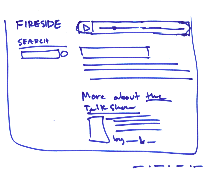
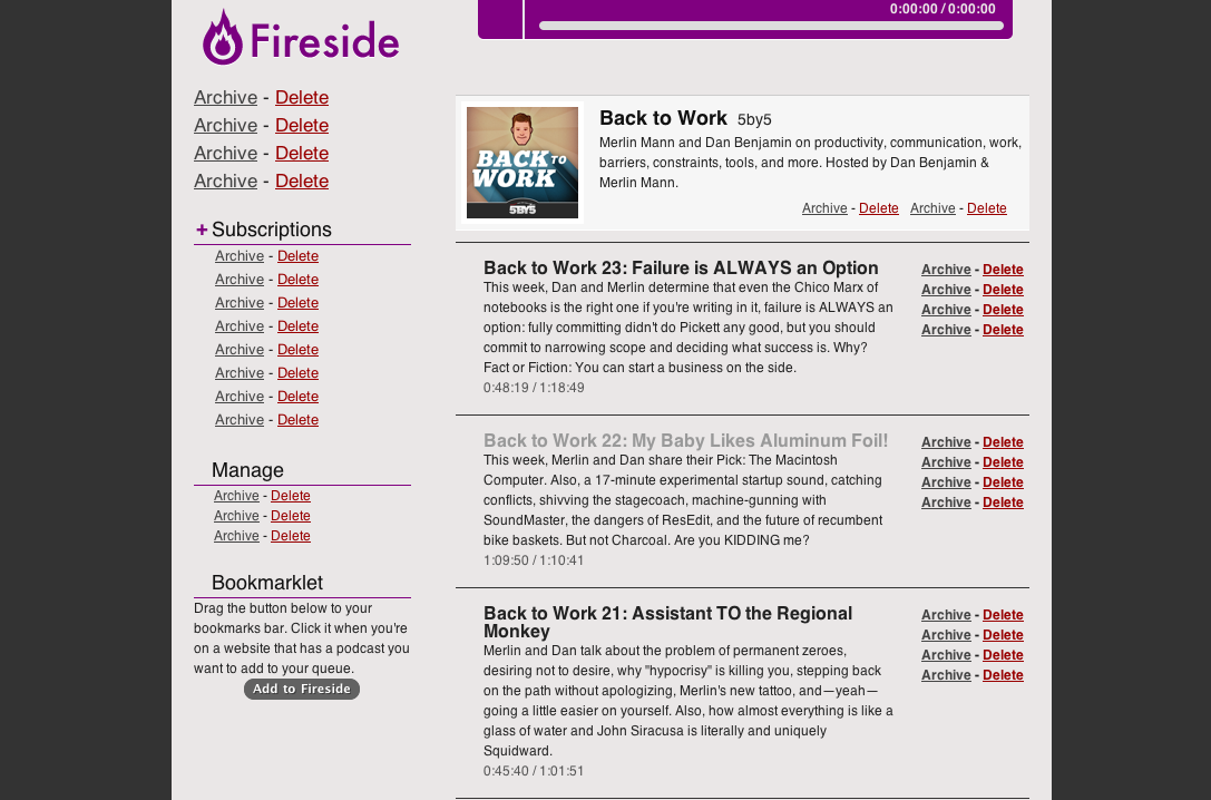
The website is pretty simple, and hasn’t changed much since the first few sketches.
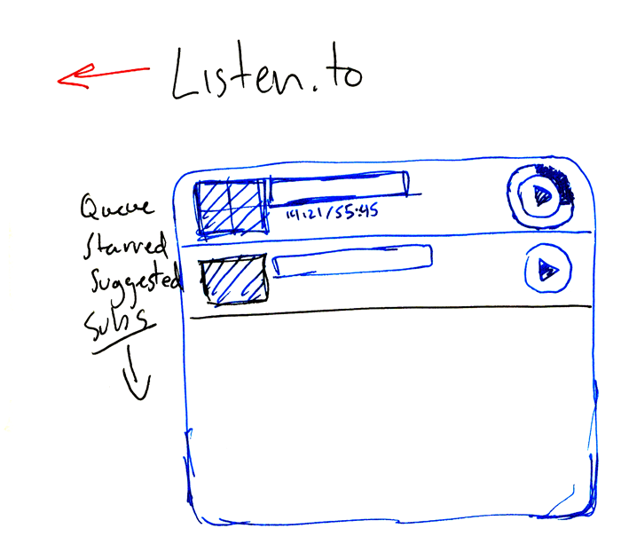
When I was first working on the app, I wanted to call it “Listen” and center it around a metaphor of headphones. “Listen” would have even less Googlability than Fireside, so I ended up ditching that. Having iTunes-style progress bars that go around the play button was an early idea, but didn’t end up making the cut because having a more traditional progress bar was easier for the user.
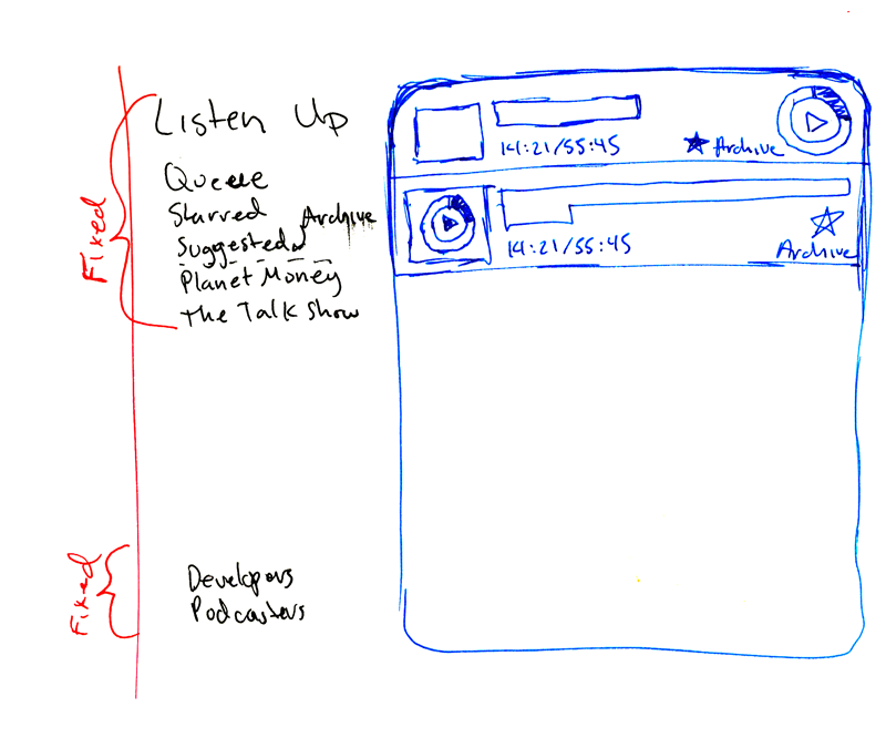
I tried focusing the app around an idea of a queue, but that was too programmer-y, and ended up just calling it the unplayed list. Also, the fixed menu on the left didn’t work, because it didn’t scale with a large number of podcasts.
I really like doing quick sketches in a permanent marker, since the fidelity is super low and you can’t get lost in filling in the details or having to come up with fake copy. I’m very sure I straight-up stole this idea from someone, but I can’t for the life of me remember who it was. Either way, it’s great, and you should steal it, too.
 Javascript errors-of-intent are super cool
iPhone App
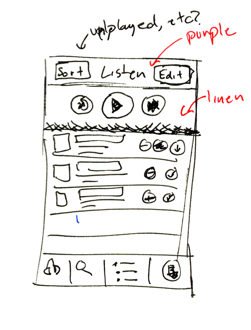
I thought about having a main playback control area at the top; it would be sort of an inset area that would have a linen background (I’m the only developer that actually likes linen as the bottom layer of the OS, sue me) and playback buttons that would let you quickly play, skip, and seek through the podcast.
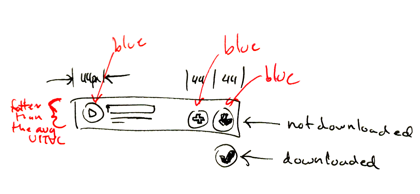
I also sketched out a table cell with buttons on it, for adding to your queue, downloading, and playing. The buttons ended up being too small to really be effective, and the cognitive load on the user of all those buttons became overwhelming.
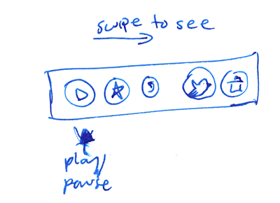
To solve both of those problems, I ended up choosing not to have a playback control area, and instead stealing Loren Brichter’s swipe-to-action menu. This didn’t make it into 1.0, but 1.1 had the menu. Teaching users that it even exists is a difficult problem, one for another blog post.
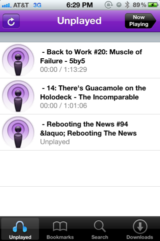
At this point in the development of the app, I had the syncing working, but only just barely. I didn’t have a player screen yet, so all play/pause actions were controlled by the button in the top left. Once I fleshed out the podcast table view cells, the app slowly started to take shape.
